Color Palette
Our palette is our calling card.
Brand colors are set and cannot be changed in any way.
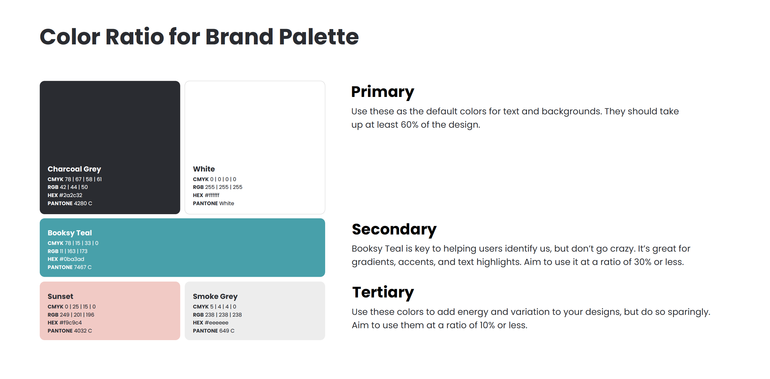
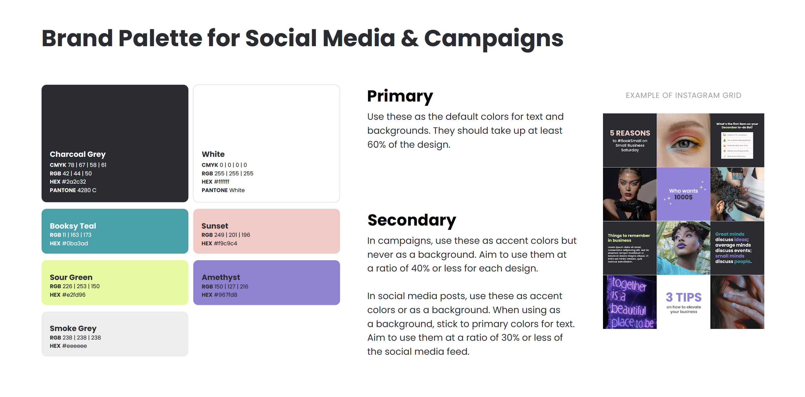
Primary, go-to brand colors are Charcoal Gray #2a2c32 and White.
Use these as the default colors for text and backgrounds. They should take up at least 60% of the design.
Secondary color is Booksy Teal #0ba3ad.
Booksy Teal is key to helping users identify us, but don’t go crazy.
It’s great for gradients, accents, and text highlights. Aim to use it at a ratio of 30% or less.
Tertiary colors are Smoke Gray #eeeeee and Sunset #f9c9c4.
Use these colors to add energy and variation to your designs, but do so sparingly.
Aim to use them at a ratio of 10% or less.
Check the color codes here


